Back in early 2021, I was dissatisfied with the personal website that I had built with Carrd. Though I had always had an interest in computers, I had never made the leap to programming. But when I found this GitHub Pages thing, I decided it might make for an “interesting project.” I learned some HTML and CSS, and created something I was quite proud of. Once I had learned more, I came back and rewrote it, now with some neat styling. By the end of 2021, I decided would learn some real programming with this JavaScript thing. In January of 2022, I finished and uploaded my last rewrite, incorporating a few bits of JavaScript (some of which was truly horrifying) and less rudimentary HTML and CSS.
I don’t think that I had any idea what I started back then. Since then, I have advanced significantly as a programmer, garnered quite a collection of knowledge and skills, built and helped build cool things, attended awesome events, and met many amazing people. It has been an incredibly fulfilling journey, and I’m excited to do it for the rest of my life.
Let’s get onto this new website.
Getting Start with the Rewrite
Though I started with the web, nowadays I mostly write Rust for the Linux command line. Accordingly, I did not have a particular technology in mind. I did know a few things:
- I wanted it to be generated. My last website was 100% handmade, but I didn’t need to duplicate code anymore because I since gained the know-how to use a framework or generator.
- I wanted it to be statically generated. I didn’t need any dynamic content, so server-side rendering would’ve been pointless, and static hosting is cheaper, easier, faster, and more secure.
- I wanted to ship as little JavaScript as possible. I wanted a simple and fast website, and not the interactivity that most frameworks are built for. That meant I wanted a framework that did as much as it could at compile time, not frameworks that ship lots of client-side JavaScript.
I wasn’t sure what would suit my needs, but I had been keeping my eye on the web development world, so I had a few ideas:
- A handmade home page with a static site generator with a custom theme for the blog. I considered Zola, Cobalt, Eleventy, Hugo, and Jekyll.
- An HTML template engine, like Parcel with PostHTML’s Include Plugin.
- A JSX-based static site generation framework like Astro or Next.js.
Eventually, I decided that I would get the ball rolling with design, then implement the home page with plain HTML and CSS, and then finally pick a generator and transition over to it.
Design
I did the design work with Penpot. I remembered having mixed feelings in the past, but I quite enjoyed it this go around.
I knew I wanted a few things:
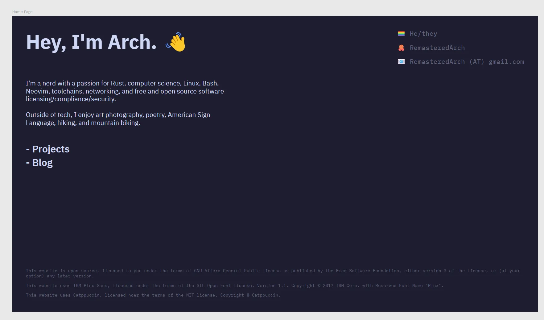
- The header “Hey, I’m Arch. 👋”
- A prominent link to my GitHub account
- A basic summary pertaining to my interests, particularly technical
- My pronouns
- A pride flag
- A proper legal notice
- A list of my projects
- A list of my blog posts
The last two didn’t work out — I wasn’t going to be able to have two arbitrarily long lists on a mobile device. I just pushed them off onto their own pages, and I think it turned out better for it.
The only single source of inspiration I can point to, other than my previous website, was https://www.fantail.dev/. The site has since changed and the Internet Archive doesn’t have a capture with CSS, but here’s the rough layout to my memory:
Name            - Contact
Blurb           - Contact

Project  Project  Project
Project  Project  Project

     Legal Footer
The only inspiration I took can be seen in the header, with the big heading text on the left and the list of contacts on the right.
Here’s the final draft I created with Penpot before I got to implementation. It was pretty close to how it ultimately came out, other than adding link styling, a different icon for my GitHub account, and a brighter color for the subtle text.
The First Home Page
Next step was implementing the new home page in plain HTML and CSS. Because Penpot is oriented around CSS, translating the design was fairly easy. From that point, a few more things happened:
- Added styling for links
- Changed the icon for my GitHub account to the Git logomark instead of a cat or octopus emoji
- Translated units from
pxto relative units likeremandch
I had decided to write my first implementation in plain HTML and CSS because I wasn’t sure what framework I wanted, and I didn’t want to have to juggle learning it and getting the home page done. But now, it was time to choose.
Picking a Framework
Ultimately, I chose Astro. Having decided I wanted more than a front page in HTML, it was clear that an HTML-oriented tool would be my best bet.
The first thing I reached for at this point was an HTML template engine, because I thought that the simplicity was what I needed. Looking around, the only one I saw that fit my needs was Parcel and its integration with PostHTML. But after a rocky first experience with the toolchain, I decided I would give Astro a shot.
Next.js had also been on my mind, but it seems to be focused mostly on server-side rendering, particularly with React. Astro, on the other hand, is built for compile-time static site generation.
Immediately, I was impressed by Astro. Its documentation is thorough, beginner-friendly, and aesthetically pleasing. Coming from Rust, I appreciated that Astro has an idiomatic project structure and editor setup. The standard language service (and its Prettier integration), in particular, is wonderful. As a Neovim user, Astro was the first time it felt like I was having a first-class experience in something other than Rust.
Transitioning to Astro
Getting started with Astro is easy:
$ # Step through the instructions
$ # and get a basic site set up
$ npm create astro@latest
$ # Launch a development server and
$ # open the link in your browser
$ npm run dev
From this point, I tweaked the configurations, moved all my previous work into the file layout of an idiomatic Astro project, split the home page into various components, and I was on my way.
Expanding the Site
The first new page was the projects page. After a quick stop in Penpot and a little bit of hacking, it was done. The end result is a simple grid of cards. It’s not my favorite, but it’ll do while we wait for masonry layout to land in CSS. The page is generated using Astro’s Content Collections, where each one is its own YAML file defined by a Zod schema, like so:
title: nvim-config
description: My personal neovim config.
first_commit: 2024-02-02T09:38:24-08:00
links:
    - { type: git, url: "https://github.com/RemasteredArch/nvim-config" }
Up next was blog posts. Specifically, the list of them. This takes a timeline format that chunks by year. Like the projects page, this is generated from a Content Collection. Each blog post, like this one, is a markdown file with a YAML front matter:
---
title: Rewriting My Website, Again
description: I rewrote my website again. What changed? Lots.
authors:
    - remasteredarch
published: { iso: "2026-06-23T13:30:00-07:00", timeZone: "America/Los_Angeles" }
tags:
    - web-development
---
The published (and last_updated, not depicted) fields
are a hand-rolled time type that I use for displaying times in their appropriate time zone.
Implementation was rocky to say the least, but I eventually settled on the current form.
What I wish could be done was working off the offset in the ISO date time string,
but offsets aren’t timezones.
Date still does most of the heavy lifting,
but I am very excited for the Temporal proposal to land in ECMAScript
so that I don’t have to do as much of this.
These are annoying, sure, but they do what I need to:
- Date times on different days are displayed separately:
# "Published on Tue, October 29, 2024 at 12:54 PM PDT"
published: { iso: "2024-10-29T12:54:33-07:00", timeZone: "America/Los_Angeles" }
# "Last updated on Wed, October 30, 2024 at 5:55 PM PDT"
last_updated:
{ iso: "2024-10-20T17:55:23-07:00", timeZone: "America/Los_Angeles" }- Date times on the same day are displayed separately, and the embedded time zone is accounted for:
# "Published on Sun, October 20, 2024 at 12:54 PM PDT"
published: { iso: "2024-10-20T12:54:33-07:00", timeZone: "America/Los_Angeles" }
# "Last updated at 5:55 PM EDT"
last_updated: { iso: "2024-10-20T17:55:23-04:00", timeZone: "America/New_York" }
The authors and tags lists are references
to items from the authors and tags content collections:
name: RemasteredArch
contact:
email: RemasteredArch (AT) gmail.com
website: /
socials:
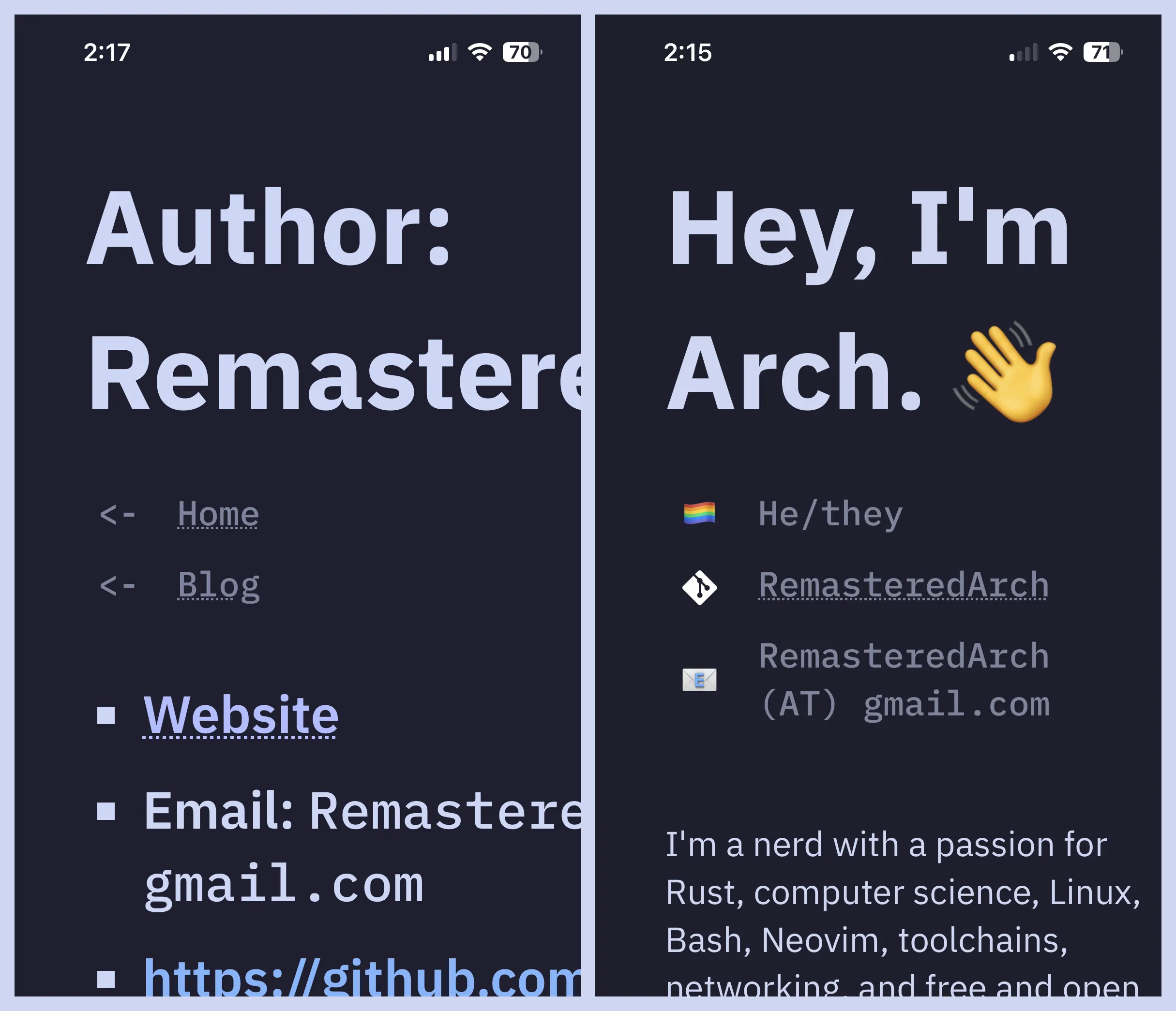
- https://github.com/RemasteredArchEach author then has their own generated page. Here’s mine.
Tags work the same. Here’s the page for the web development tag, which is simply defined like so:
name: Web DevelopmentNext up was the CI/CD pipeline with GitHub Actions. Because this site is built on GitHub pages, it’s not all that difficult. In fact, there’s a prebuilt Astro action available, but I decided to write my own for the sake of learning.
Though reading documentation, inspecting source code, and general trial-and-error with Act,
I did eventually come out with a successful pipeline.
Well, we’ll have to see, but I’m pretty sure it’s good.
At grand total of 61 lines and only seven steps, it’s not terribly complicated.
Currently, it’s set to trigger on any push to a hard-coded branch,
but I’ll probably set it to trigger on page_build
(a push to the branch that publishes to GitHub Pages)
after release.
Oh Dear, It Doesn’t Work on Mobile?
Though I had designed with mobile in mind, it didn’t turn out to work very well. Large text and too much padding meant that what text could even fit on screen was meager.
The fix was pretty simple.
An @media rule reduced padding when the screen is smaller than a certain width (in rem),
then another reduces the text size when the screen is slightly smaller still.
@media rules were something I was trying to avoid,
but I’m alright with having two.
Release
Following the initial spree of development in late 2024, this project went mostly dormant until June 2026. Picking it back up, I spent the first several hours working on porting the website from Astro v4 to Astro v7. It took some time, certainly, but I was impressed with Astro’s changelogs and migration guides and found it to be largely painless. Following that, it was whack-a-mole with various issues, some of which I had known about — like solving the previously mentioned mobile layout issues — and some of which I had discovered as I picked the project back up.
As of now, I’m finishing this blog post and intend to publish the website soon. Lots of work remains, but this rewrite will never land if I wait for perfection. I hope you like it!